Back at the end of 2017, nearly every web designer and web development company published a blog post about the “10 Things to Expect for Web Design in 2018.” In fact, when researching for this article, we counted no less than 20 pieces with almost this exact title.
Does web design change that much every year? That SO many articles need to be written about the subject?
Actually, yes. Business owners, organizations, and even individuals often find if they don’t update – or at least refresh – their website every couple of years, it begins to look dated (sometimes super-dated). Furthermore, it likely isn’t taking advantage of some new (likely-fairly-awesome) available functionality. And… not to mention, rankings have probably started dropping since the search engines too, frequently change what they are looking for when indexing and ranking web pages.
So here it is… Our 2018 web changes article.
Of course, we had to be a little unique (ok… and take the easy way out) and deliver ours mid-year. We get the advantage of hindsight.
Obviously then, our analysis stands to be more accurate. Plus, you get the benefit of learning what is REALLY working, instead of what some techno-psychic with a keyboard dreams up in an attempt to drive trends toward what HE wants to see.
Here’s how web design is (actually) evolving in 2018…
To be flat or not to be flat… that is the question
Most experts predicted a shift toward (even) flat(ter), minimalistic design. Content was to take over and become the focus over “art.” Yet, that hasn’t happened to the extent predicted.
Sure, gone is the flash and some of the major twisty-turning, form over function, web design we had never loved but gotten used to… However, artistic expression has stayed an integral part of web design.
And truthfully, we’re glad. The imagery chosen – and the way it’s displayed so that it “says” something – is a vital part of building a brand. Important, is just that it does that – helps to support the brand – instead of trying to BE the brand.
OUT with the popup, lead capture, homepage and IN with the “Card?”
True, popups – as we have come to know them – are GONE (thank goodness!) in theory. But the concept has not disappeared. The beginning of 2017, just saw the theory behind why popups work, take on a new form.
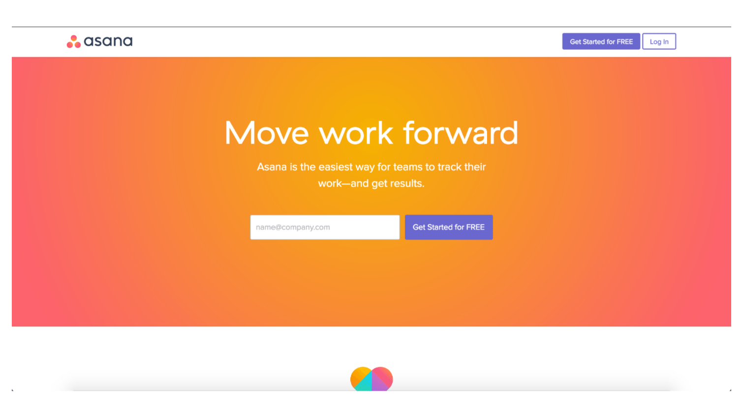
In 2017, the ‘card’ and grid / metro style homepages became uber-popular. All these are essentially a morph of the landing page and popup, serving as a gateway into the full website. They understand you have only a few seconds to capture a visitor’s attention and get them to hang on and stick around. Furthermore, they aim to do just that – tell them what you are going to give them and entice them to stick around and let you do it.
Mid-2017 had websites backing away from the purest rendition of these ideas. Instead, they were landing (pun-intended) somewhere in the middle—a “micro-homepage” that is much simpler than the traditional homepage but not quite as minimalistic as the card, grid, and metro styles alone.
See Hootsuite for a great example. In the first few months of 2017, Hootsuite was trying out the ‘card’. Now, however, they have kept the best of the card format and added a little content to try and speak more to the customer’s needs. This is a return to more of the solution-based marketing that has always worked best and we love it! We expect to see more sites adopting this option in 2018.
Minimalistic Menus (Yes!)
Site architecture may still be complex (possibly, more than ever) but nested under micro-menus. Some progressives are making each of these menu sections micro-sites. This lets the designer and developer try out different styles and test what works best.
Furthermore, the mobile menu-style is now not just for mobile. Taking the emphasis away from the menu itself – and the old-fashioned “header” – it brings back the focus to the main content. Of course, this means that main content must be strategic since it’s now front and center with no periphery accessories or cosmetics to detract from it—or make it more attractive.
Better design processes—improved collaboration and communication
The move toward flatter website design – even if the wave receded back quite a bit – did bring about one important change that has “stuck.” This year, we have seen fairly huge changes toward more collaboration and communication between developer and designer in the website creation process. The result being finished products that tell a story and “do” more towards lead nurturing and conversion than in the past—a well-deserved and long overdue transition away from the “brochure” style web page.
Larger and bolder fonts and typography that means something to the design
This was a prediction we are SO happy to see come true. Typography has long-been undersold in our opinion. The larger and bolder fonts make a statement without screaming at you with design that won’t stop moving. It also takes up space—without sacrificing whitespace. A well-chosen font communicates so much to the visitor… without “saying” a word!
Responsive web design that is truly responsive – adaptive – to different screen types and sizes, automatically
Since over half of all visitors come to a website via a mobile device, having a mobile-friendly website is vital. Yet, Google says, “No more separate mobile sites!”
Enter the “responsive website design” movement. The idea is that a website be intentionally-designed for different screen sizes. The only problem has been that this required specific coding for all those different screen sizes.
Yet, in 2017, we seem to have solved that issue. Newer web design applications (or new applications for the standard design systems) make the adjustments for us – making responsive design a given. Furthermore, Google’s new preference for “mobile-first” indexing, makes it a “must.” Thus, any business or professional not taking advantage of this capability is pushed to the back of the line.
2018 should see this becoming standard.
More color!
About this 2018 “change” we say, “Thank Goodness!” Gone are the sepia-styled monochromatic color schemes of the (short-lived) minimalism movement. This (bland) trend has been replaced by bright, bold – yet soothing – colors that make a statement. Gradients are even back in, but in a more tonal way—where extremes blend together to meet somewhere in the middle.
Increased Integration of Movement, Animation, and Interaction
A cool aspect that came into play more in 2017 and that we expect to see a ton more of in 2018, is a greater desire for websites to interact with visitors on a deeper level—to keep them engaged for longer and more vested in the site itself. This affects conversion and thus, ranking, since time on site is a factor. This also integrates the long-held marketing tactic of the “teaser” that unfolds slowly, building interest, and deepening attraction.
Again, it’s no doubt simpler for us to play armchair quarterback – or coach – than to make our own predictions. It’s kind of like taking the easy way out to sit back and point out where others got it right or wrong.